Branding
Scroll ↓
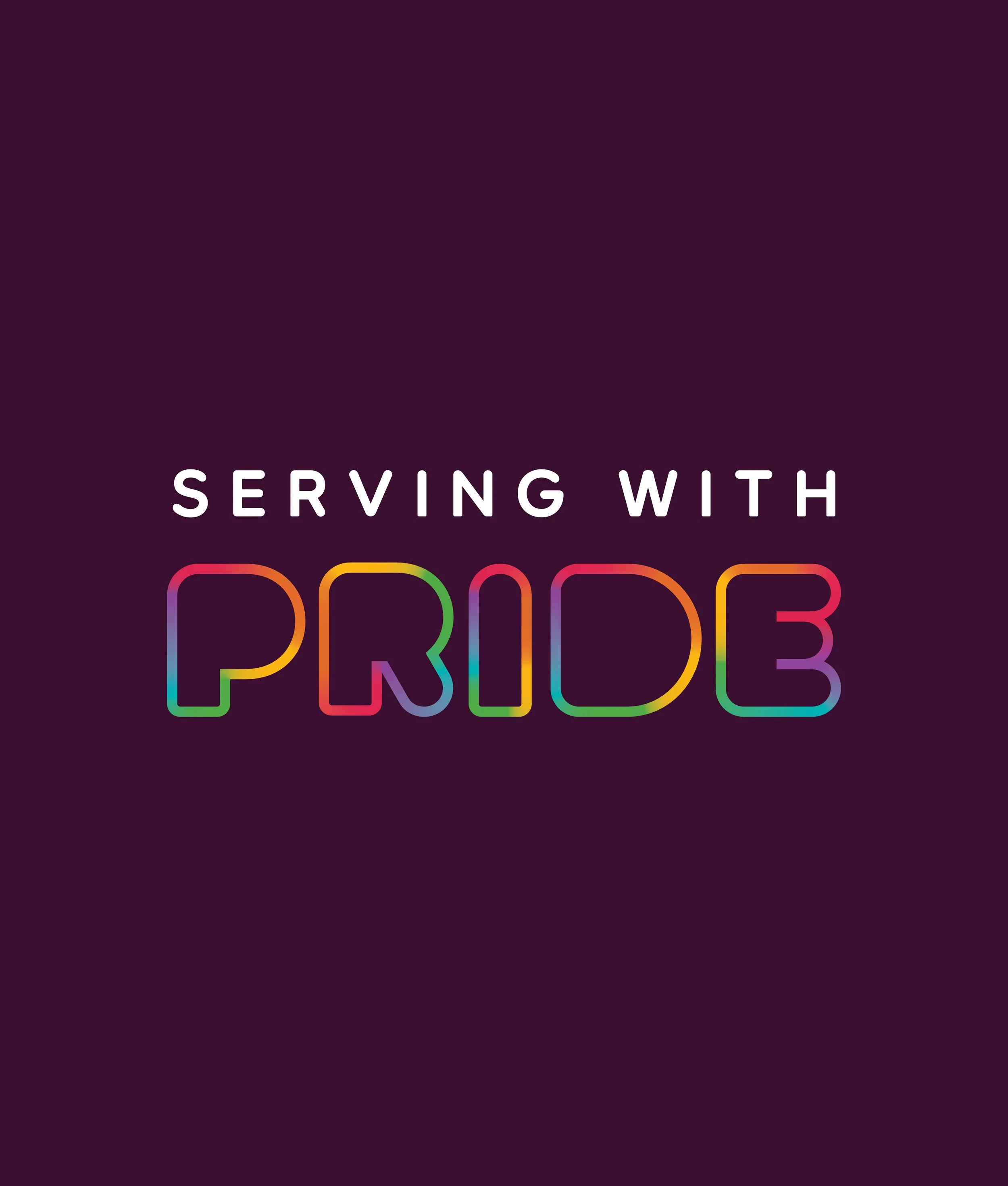
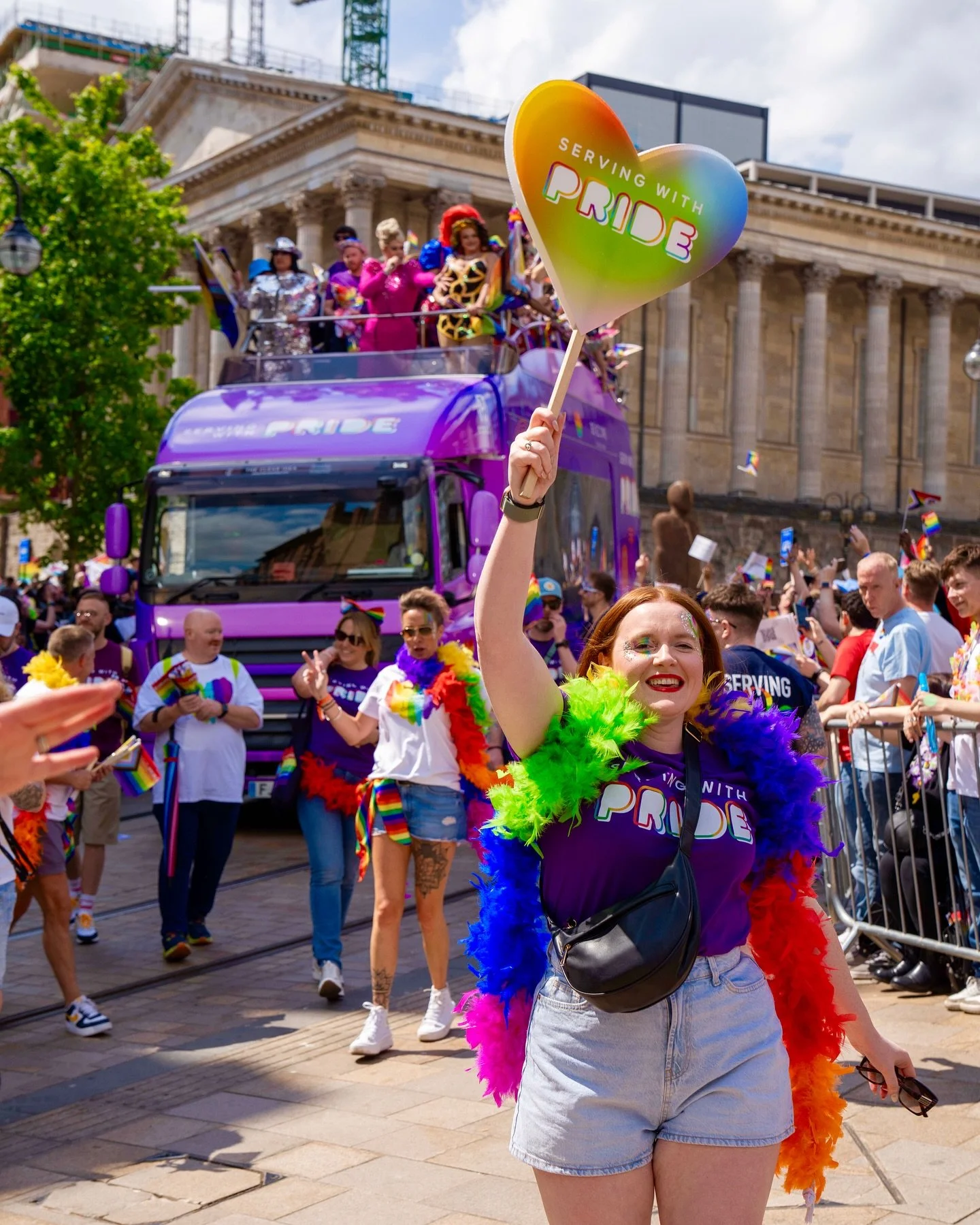
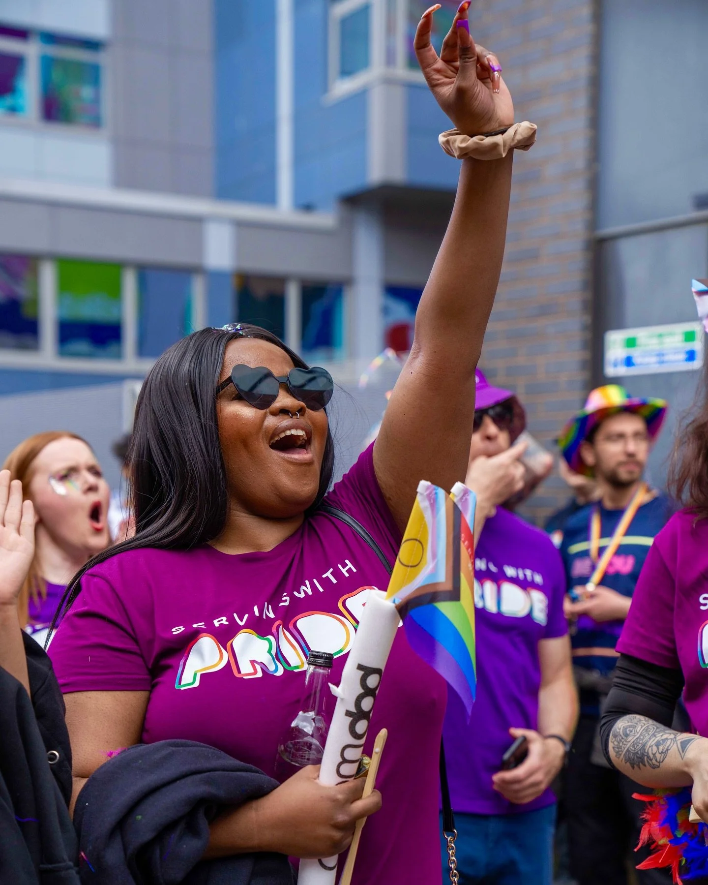
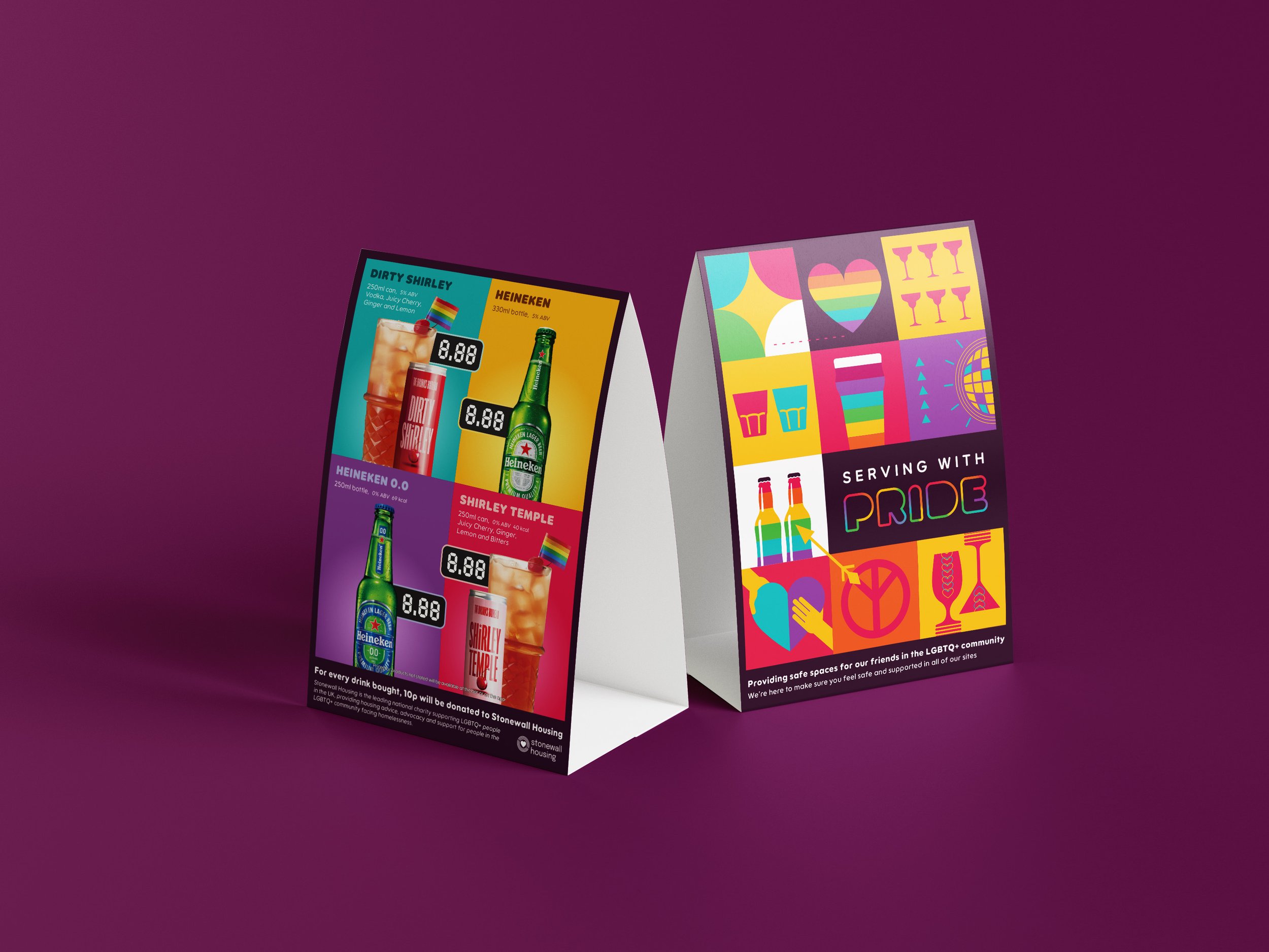
Serving with Pride
Stonegate Pride identity celebrates inclusivity and reinforces their venues as safe, welcoming spaces for the LGBTQ+ community.
"Serving with Pride" does two things: it proudly supports Pride, and it gives a
nod to the hospitality world, where great service is at the heart of everything.
Visually, I created a flexible tile-based design system, made up of playful illustrations representing drinks, good times, love, and community. The colour palette is inspired by the Pride flag, but reimagined with vibrant, unexpected pairings that feel fresh and adaptable - designed to stand out both during Pride celebrations and throughout the year.
The result was a bright, versatile identity that can be mixed and matched across posters, menus, merch, and digital platforms - keeping things consistent while allowing each venue to make it their own.


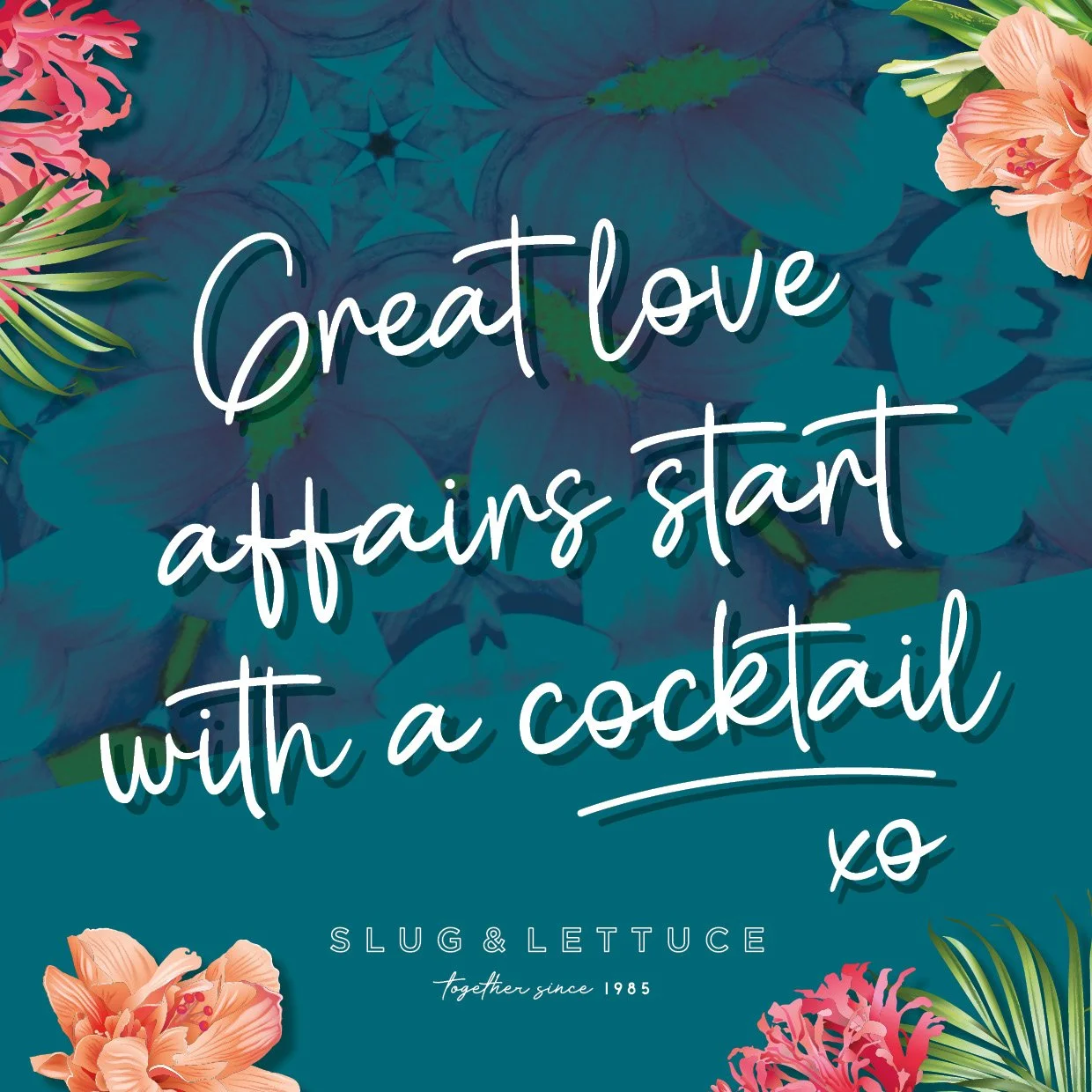
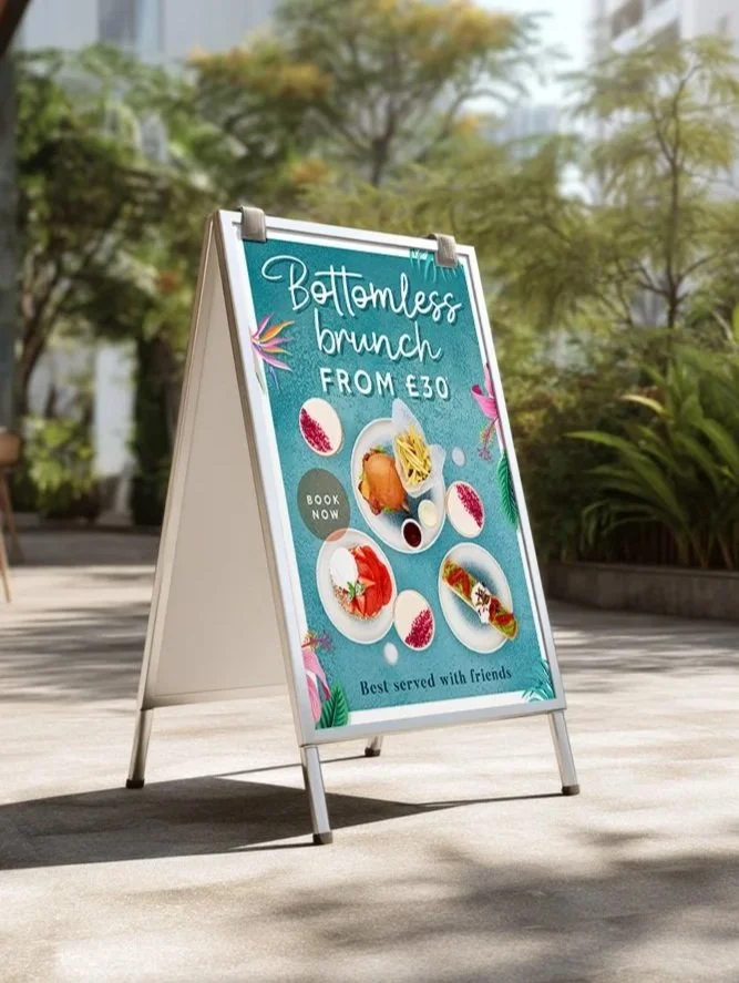
Slug & Lettuce
Brand Evolution
Post pandemic, Slug & Lettuce needed a brand refresh to re-engage customers and re-energize the experience. Building on the core elements of their existing identity, the goal was to evolve the brand into something vibrant, contemporary, and welcoming, designed to entice guests back after a difficult period.
The refreshed brand expresses the playful Slug & Lettuce personality through a bold and modern visual language: striking colours, layered textures, and floral motifs that mirror the interiors of each venue. A confident, cheeky tone of voice runs throughout all communications, reinforcing the brand’s fun and sociable spirit.
Working closely with the Head of Marketing, I helped lead a full-scale brand update, from photography and menu design to posters, digital assets , social media and wider marketing collateral.